In sports, uniforms are sometimes taken for granted. With enough time, even the nicest jersey or sweater can begin to feel boring and routine. But over time, great sweaters become iconic. A beautiful hockey sweater tied to a winning team goes down in history, while big mistakes on bad teams go down in infamy (looking at you, New York Islanders).
In today’s NHL, there are more sweaters than ever, with most teams having a third option, many having a retro or throwback alternative, and some having stadium series or Winter Classic alternatives.
For this article, we’ll take a look at the 10 nicest current sweaters, but we’ll focus on those uniforms that are worn more than once in a season. So let’s take a look at the list!
Honorable Mentions
Dallas Stars Home
The Dallas Stars home jersey doesn’t get a lot of recognition, but its “Victory Green” is probably the most unique (and maybe the brightest) color on any sweater in the league.
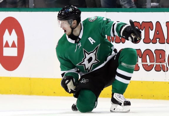
The Stars have yet to have a lot of postseason success in the relatively new sweater design, but once they do, it could become more and more iconic. It certainly stands out by color alone.
Vegas Golden Knights
The Vegas Golden Knights are the newest team on the block, and in the NHL, their sweaters had a lot of stiff competition to live up to. But the new design delivered with a look mixing classic and modern elements and a logo that subtly hints at both their name and their city.
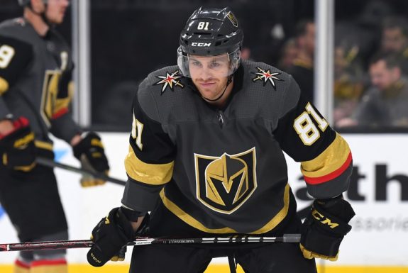
From the gold rings on the sleeves, to the shoulder logos, to the logo itself with the Vegas “V,” these sweaters just work. It doesn’t hurt that the Knights found immediate success in the uniform, reaching the Stanley Cup Final in their very first season.
10) Buffalo Sabres 50th Anniversary
When rumors leaked last summer that the Buffalo Sabres’ third jersey would be an all-white alternative, fans initially met the news with derision. All white jerseys are always a risk, and unless you get the ingredients just right, it can quickly become a recipe for disaster.
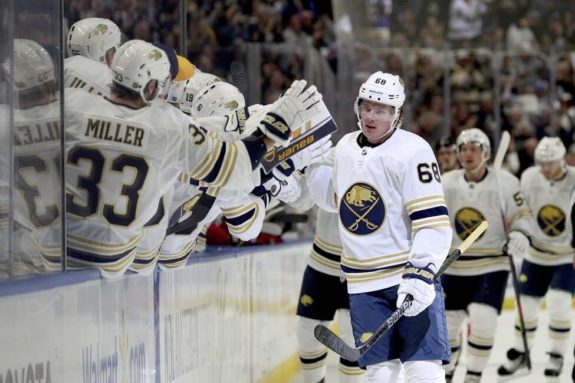
Well, the chefs in the Sabres’ front office nailed this recipe. The white and gold combination on this sweater is perfect, and it’s distinct from anything in the league right now, particularly when paired with the white gloves most Buffalo players choose to wear with it.
Longsuffering Sabres fans got other good news at the same time when the team announced that it would return to royal blue as a primary color in the 2020-21 campaign. As we said, uniforms often make a big difference, and the Sabres have been rebuilding for a long time. Perhaps the new sweater combinations will provide just enough swagger to finally get them over the hump.
9) Winnipeg Jets Home
Since they took off from Atlanta, Georgia and landed in Winnipeg in 2011, the Jets have had some of the sharpest home sweaters in the entire league. Though they aren’t exactly plucked out of Jets jersey history, they still have a very classic feel about them.

The revamped Jets jerseys use the same color pattern as the originals, but the logo has changed drastically. The logo pays tribute to the Royal Canadian Air Force — but more particularly to the 17th Wing, which is the Canadian Air Force base in Winnipeg. The uniforms nicely represent the second coming of a very important Canadian organization.
8) Detroit Red Wings Away
The Detroit Red Wings organization has fallen on hard times for the first time in many, many years. But the sweater the players wear still harkens back to the history shared by the likes of Gordie Howe and Steve Yzerman, Ted Lindsay and Nicklas Lidström.
The Red Wings have won 11 Stanley Cups in their illustrious history, the most by far of any Amerian franchise. And through it all, they have worn essentially the same sweater: red and white with the iconic winged wheel.
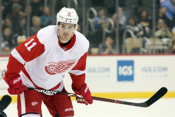
The logo on its own is one of the best in the NHL, maybe in all hockey. It both captures the team’s name and the city’s history, and it stands out perfectly on the white away sweater. As any hockey purist will tell you, white home sweaters used to be the norm, so for many Original Six teams, the away sweater feels more classic than the home, anyway.
7) Arizona Coyotes Kachina
There are few fashion items that can scream “the 1990s” and be absolutely gorgeous at the same time, but the Arizona Coyotes Kachina sweater does precisely that. This homage to a character from Pueblo Native American folklore debuted as the primary road sweater for the Coyotes’ first seven seasons, but even when they were away, they remained in the fans’ hearts.
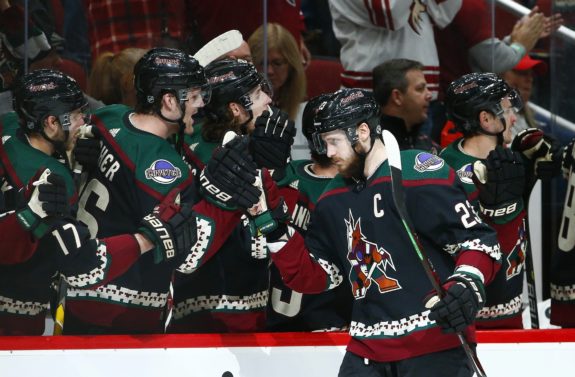
Last season, the Coyotes announced the long-awaited return of the Kachina sweaters. “We’re thrilled to make our black Kachina jersey the official third jersey of the Arizona Coyotes,” Coyotes’ Owner Andrew Barroway said at the time. “These are iconic jerseys that are beloved by our fans and players.” They’re beloved around the NHL as well, and hopefully this time, they’re here to stay.
6) Calgary Flames Alternate
Usually, when a team uses its sweater to honor its history, it’s because of the team’s long tenure in the community. But when the Calgary Flames debuted their current third jerseys, it was with an eye to their history in another city: Atlanta, where the Flames resided from 1972-1980.
The current Calgary third jerseys are more-or-less a stitch for stitch redux of the Atlanta Flames jerseys worn during that era. And with as sharp as they look, we can’t say we blame them for picking the look back up.
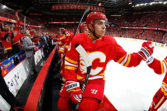
If there is any complaint with this sweater, it’s a minor one. On the Flames’ primary jersey, the “A” that demarcates an alternate captain is also an homage to the Atlanta Flames’ “A” at the center of those jerseys. For whatever reason, in replicating these sweaters, Adidas chose not to put that touch on the third sweater. It’s a shame, as that’s one of the nicest little touches on any sweater in the NHL; however, the sweater as a whole is still one of the sharpest in the league.
5) Chicago Blackhawks Away
The Chicago Blackhawks jersey has undergone very few changes since the mid-1950’s. While the jersey is an NHL staple, the team logo has received some backlash over the years as it had been deemed culturally insensitive. The logo’s origins stem from team founder’s division of the U.S. Army. With this aside, the Hawks uniforms are extremely sharp and still merit a spot on the list. The ‘old school’ style makes the jersey one of the league’s nicest.
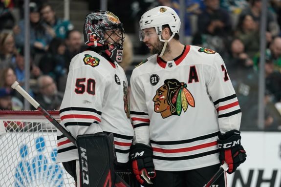
In today’s climate, there will always be discussions about whether changes should be made to the Blackhawks logo. But it remains iconic, not only for its ties to Blackhawks legends like Tony Esposito and Stan Mikita but also for its association with the modern-day Blackhawks dynasty that won three Stanley Cups in six seasons.
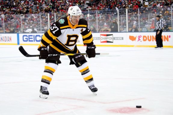
4) Boston Bruins Home
The Boston Bruins were named by their original owner, Charles Adams, who wanted the team to be powerful and feared. In Adams’ vision, the team would build a reputation to match its name. The ‘big bad Bruins’ have been one of the most physically dominant teams in NHL history, and their powerful uniform colors and team name match that perfectly.

Like some of the other Original Six teams on this list, the Bruins’ logo hasn’t significantly changed over the years. Like its winged counterpart in Detroit, the spoked wheel is an iconic hockey logo. Yet another classic on the list, these uniforms are synonymous with the hard-hitting hockey that has made the team so successful since the start of the NHL.
3) St. Louis Blues Heritage
We mentioned that one-time use jerseys would not be on the list. But fans loved the St. Louis Blues’ 2017 Winter Classic sweaters so much that when it came time to announce a third jersey for the 2018-19 season, there was no question the design would return.
The so-called “Heritage” sweater returns to the design of the Blues’ 1967-68 inaugural season, but with subtle added touches, including the flag of the city of St. Louis stitched inside the collar. Is it any surprise that in their first season wearing the sweater regularly, the team won its first Stanley Cup?
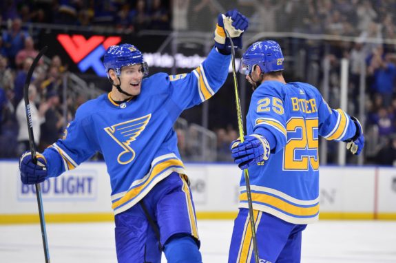
The baby-blue color of this uniform is as slick as any color in the league, and the Blue Note logo, while not as iconic as a few we’ve discussed, is still one of the most beloved in sports. It’s the favorite uniform of Blues fans, and one of the freshest in the entire league.
2) New York Rangers Home
The “Broadway Blue” New York Rangers jersey is one of a number of classics found on the list. A jersey donned by greats such as Wayne Gretzky, Mark Messier and Brian Leetch, (among many others), the Rangers jersey represents New York very nicely. The glam of the city and its character are nicely conveyed on the Rangers’ uniform.
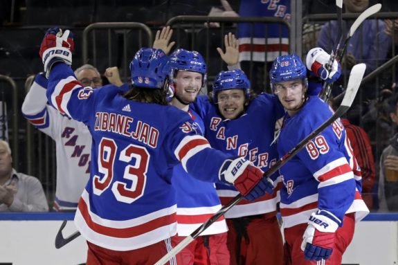
These uniforms are able to capture so many aspects of the city and country that they represent. The red, white and blue color scheme nicely pays tribute to the United States, while a little bit of Broadway flashiness depicts New York nicely. The Rangers are looking at a bright future, but with these sweaters, they’re always rooted in their history.
1) Montreal Canadiens Home
The Montreal Canadiens’ jersey is the most historic in the league; the uniform has stayed pretty much the same since the early 1910’s. The jersey has been one of the few consistent things throughout the incredible team history. Like many others on this list, the Habs’ design and jersey have withstood the test of time.
-
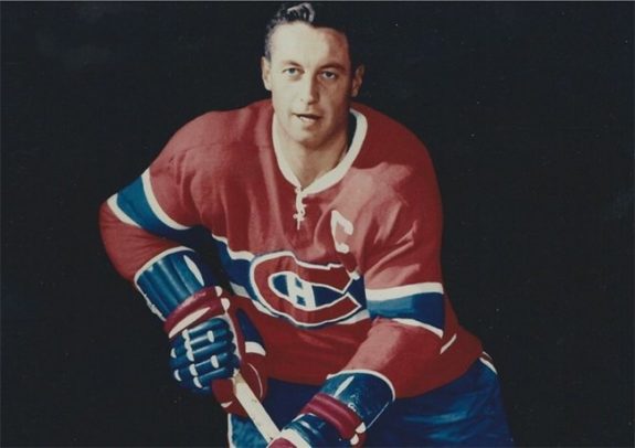
Jean Beliveau -
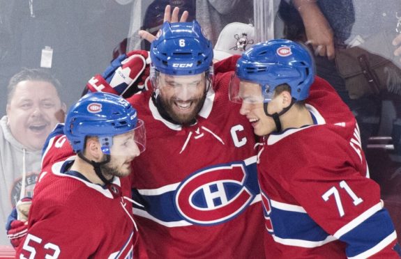
Shea Weber (THE CANADIAN PRESS/Graham Hughes)
History aside, the Habs’ jersey still merits the #1 spot on the list. The Habs paid testament to their past by adding the lace and white collar to their classic jersey to give it the ‘vintage’ feel, which many fans love. The jersey is also referred to as “La Sainte-Flanelle” which translates to “the holy flannel” or “the holy sweater.” The Montreal Canadiens’ jersey is the league’s nicest because of its history, its design and its meaning to Montreal.