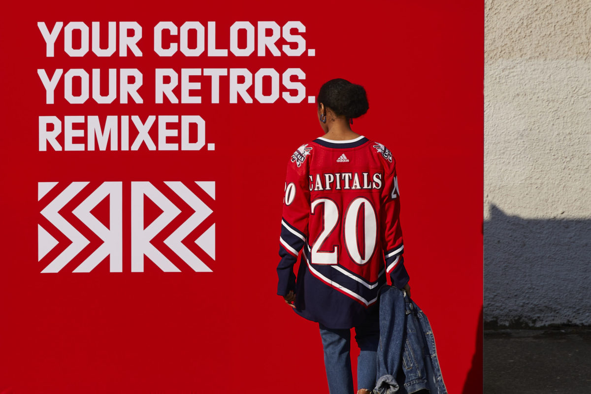
The Washington Capitals, along with the 30 other NHL teams, released their Reverse Retro jerseys for sale on Dec. 1, and it proved to be a success, selling out quickly online, according to Russian Machine Never Breaks.
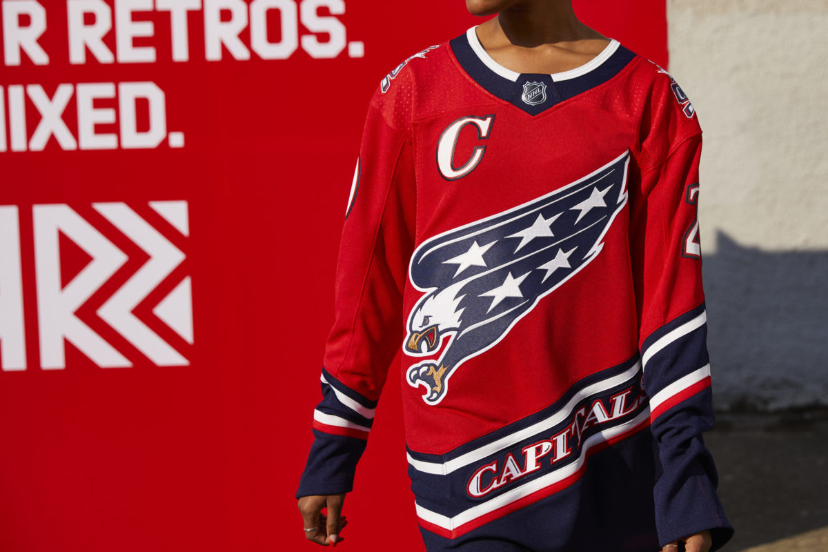
The Screaming Eagle logo, dormant since 2007, got new life thanks to Adidas’ program. Washington’s version of the Reverse Retro takes the club’s jersey template used from 1995 to 2007, using the team’s original colors. The mix so far has proved to be popular with both longtime fans who remember when the team sported the original blue, bronze and black design, as well as more recent ones who adopted the team in the Alex Ovechkin era and liked the retro design in more familiar colors.

The original concept of the design was created when the team was preparing to move from suburban Landover, Maryland, to downtown Washington to give the team a boost in sales when the rest of the league was flush with new and different designs during the 1990s — a period popular with many teams in the Reverse Retro process.
Changing to the Screaming Eagle
While the Capitals sported the red, white and blue for the first two decades of their existence after joining the league in 1974, the team sought a radical change in the early 1990s.
With the team’s original letters and stick logo near the bottom in sales as new teams entered the league and others changed their looks, the Capitals decided to radically redo their logo and colors to give them a marketing boost as they prepared to move into their new arena, the MCI Center in Chinatown.
With the success of the Los Angeles Kings’ silver and black uniform redesign in 1988 and the introduction of the San Jose Sharks popular logo of teal and black in 1991, Washington adopted black into the mix, along with bronze and a darker shade of blue. The Capitals brought in Sean Michael Edwards Design for their 1995 redesign — who had worked on the Florida Panthers’ and the New Jersey Devils’ logos — and the eagle was born.
Part of the thinking behind the design was the team needed a logo rather than just a wordmark, and the Screaming Eagle was designed to be an aggressive bird pouncing on its prey. With a marketing campaign that promised new “Flight Gear,” the organization introduced the new logo at the Capital Centre on June 22, 1995, the same night as Game 3 of the 1995 Stanley Cup Final between the Devils and Detroit Red Wings — it was also the same night the New York Islanders unveiled their “Fisherman” design.
“This is a very exciting day for the Washington Capitals,” said owner Abe Pollin, according to the Baltimore Sun. “With the new arena and logo, we are entering a new era, and we have a new spirit here.” (from ‘Caps change their image with a new logo, colors,’ Baltimore Sun, 06/23/1995)
“Maybe next year we’ll fly like the eagle on our jerseys all the way to the Stanley Cup,” Dale Hunter told the paper at the time. “It was time for a change. It was a great idea.”
While the Capitals didn’t get to the Stanley Cup Final the next season, the change boosted sales, particularly as the team took on a more aggressive marketing campaign during its final two full seasons in Landover.
In 1997-98, the NBA’s Washington Wizards adopted the same color scheme when both teams finally moved downtown midseason. A few months later, the Capitals reached their first Stanley Cup Final in franchise history, which helped cement the new look in the team’s history.
Change Back to Red, White and Blue
In 1999, a year after that playoff run, America Online executive Ted Leonsis purchased the Capitals from Pollin, and not long after, he pushed to rebrand the franchise, returning to the old red, white and blue color scheme.
A purported design by Tommy Hilfiger was placed in a hockey supply catalog in 2000, but it was quickly shelved. However, Leonsis continued to push for change away from the bronze, blue and black. The 2004-05 lockout and then league’s shift from CCM to Reebok as uniform manufacturer after the 2006-07 season delayed any redesign rollout. The Capitals opted to wait to unveil the new design until the Reebok Edge jersey was released in summer of 2007.
When the team’s redesign was unveiled at the team’s practice facility in Virginia in 2007, the Screaming Eagle was gone. The main logo became a stylized version of the club’s original letters and hockey stick logo, with the original colors. The return proved very popular, and dovetailed with the rise of the team to a Stanley Cup contender. The red jersey became a popular item at Capitals games, creating a sea of red many nights as the team remained competitive.
Washington unveiled a couple of alternate sweaters during the following years, all using red, white and blue, and all using lettering spelling out the team’s name rather than a true logo.
The Capitals used a throwback to their original 1974-75 white star-spangled jerseys for the 2011 Winter Classic and the red versions in 2015. They also briefly used two stylized throwback-type uniforms for the 2015 Winter Classic and the 2018 Stadium Series, but the Screaming Eagle was nowhere to be found, having been last seen on a uniform or team design since 2007.
But the team and Adidas decided to revisit that era of Capitals hockey in the design of the Reverse Retro program, featuring the Screaming Eagle. The logo returned in a new color scheme, as well as the team’s old Capitol Dome logo, which was the secondary logo during that time period.

“We are excited to unveil the Capitals Reverse Retro jersey that showcases a significant era of our team history,” Monumental Sports & Entertainment Chief Marketing Officer Hunter Lochmann said on the team’s website. “Working closely with Adidas and the NHL, our goal was to pay tribute to our 97-98 team, refreshing the jersey design and, most importantly, following through on the feedback from our fanbase by reinstating the iconic Screaming Eagle.”
“The original jersey was updated to use the team’s current color scheme while keeping the copper detail on the talon, beak and eye of the eagle. “I think it’s a great combination,” former Capitals goalie Olaf Kolzig told the Washington Post in a phone interview. “It combines the history of the franchise. I think it’s pretty sharp.” (from ‘The Caps’ ‘screaming eagle’ jersey is now retro, and it’s coming back as an alternate,’ Washington Post, 11/16/2020) And, certainly, Caps fans agreed, as the jersey sold well on its first day of sales.

The Screaming Eagle logo represented a transitional period in Capitals history — the team’s days in Maryland, the first trip to the Stanley Cup Final in 1998, and the first two seasons of Alex Ovechkin’s career. This was also the crest he wore while scoring “The Goal” in Arizona back in 2006.
Fans will be able to see the uniform for several games during the 2020-21 season and see the Screaming Eagle on hats, shirts and other items, harking back to when the team unveiled the logo back in 1995. With the team reportedly shelving their red 1974-75 throwbacks this season, it will be interesting to see if this design stays around for more than just a couple of games.